Dear reader,
I hope you all realize that “leothecolorman.com” is tongue in cheek. Getting a domain name using the word color is next to impossible, so “leothecolorman.com” it is. This is not a course in color; however, it is a venue to discuss the use of basic design and color in my work.
I began studying design and color in the 1950s. After four years in the Navy during the Korean War, I attended the Chouinard Art Institute, in Los Angeles,
on the GI Bill and the Disney scholarship. The iconic William Moore was teaching what I have come to know as the Bauhaus foundation course. Johannes Itten launched the course in 1919. Although there are a number of color systems available, Itten’s 12-approach to color is one of the best. It has the virtue of being simple and direct.
He defined that approach in his tremendous book The Art of Color. (Van Nostrand Reinhold, publisher.) After Itten left the Bauhaus, Paul Klee and eventually Kandinsky taught there. The Nazis closed the school in 1933 and, by coincidence, that was the year I was born.
When I entered Chouinard in 1954, Bob Winquist was also teaching the color and design course. I was a frog in the right puddle at Chouinard and ‘caught on’ to the difficult course. Bob had flown some 36 missions as a belly gunner in B17s, over Germany and didn’t always feel like coming to work, so he would ask me to fill in. As a result, I was a regular instructor during my final year and four years after graduation.
I got hooked on teaching but my time in the classroom was sporadic because I went into the design business at Studio Five with three partners. If you go to leomonahan.com, you can see the rest of my business bio, which includes the sequence of events in my paper sculpture career as an illustrator and in fine art. What is fine art, you ask? The late Neil Boyle, an illustrator and fine art painter, as well as my classmate, colleague, and close friend, said “Fine-art is an illustration with a frame around it.”
During my teaching years at Chouinard, USC, Disney Imagineering, CalArts, and the Chouinard Foundation Art School, I must have assigned or painted hundreds of boring, very technical color wheels. I figured that there must be more dynamic possibilities for the color wheel. So over a couple of years I designed and painted 24 paper sculpture color wheels with a different subject each time.
I’ve sold all but six in shows. I’m amazed at what people will buy because I was just having fun, with what was for me, an original concept.
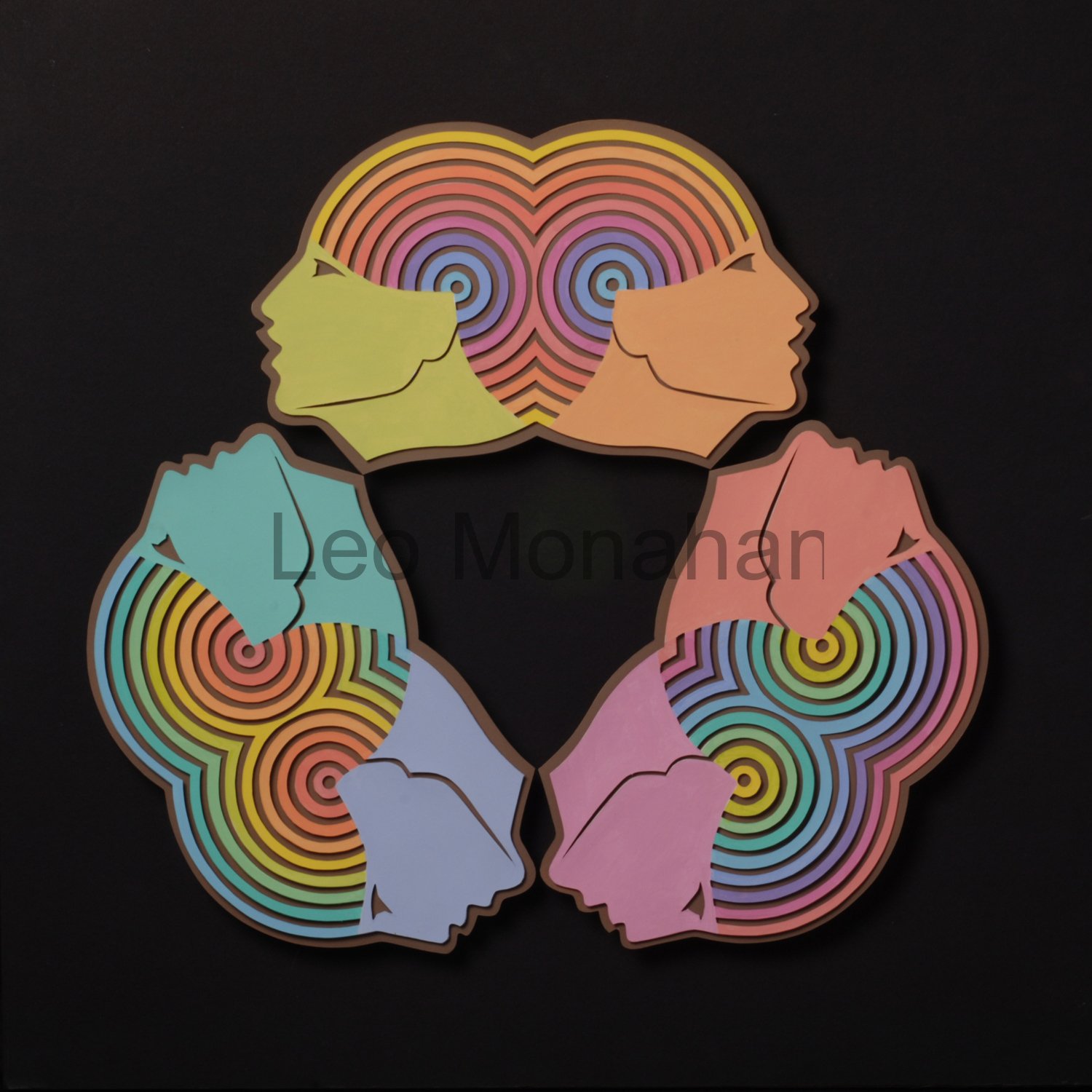
 Along with other work, I will show and talk about each of my color wheels as blogs go by. The Faces logo for this blog is one of them. This one was a briar patch, but I had to finish it because I liked the concept. The six faces are tinted primary and secondary colors. The circular head-pieces are tinted color wheels, each head having a different color in the center and moving out through the spectrum. This was a ‘measure thrice, paint once’, proposition. I really had to focus to know where I was in the process.
I cut each shape with an x-acto knife then masked and painted them with an airbrush without once making a mistake. Designing it was interesting but the finish was just pick and shovel work. At this time in my life, I don’t think I’d do it again. I’ve moved to the world of loosey-goosey.
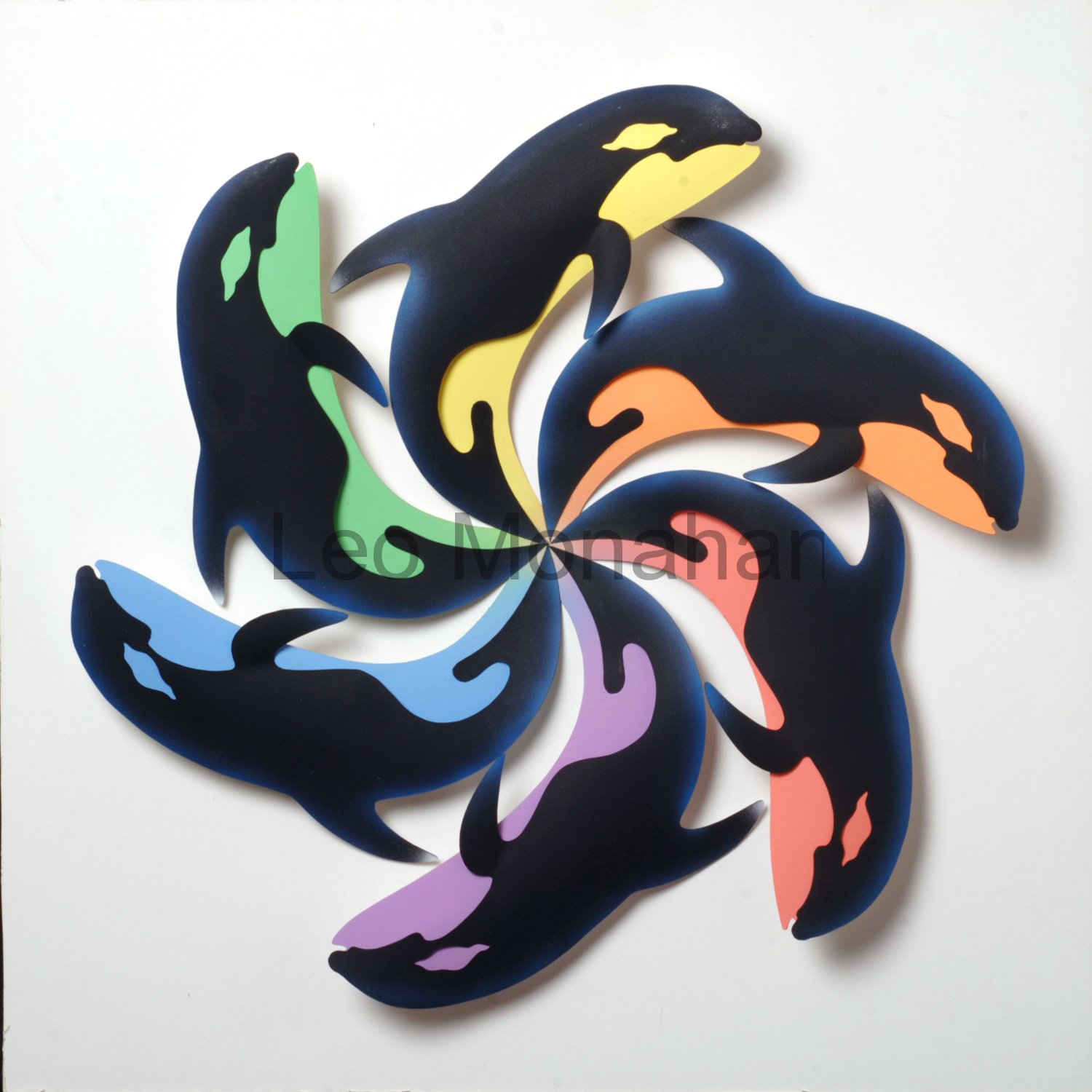
 One of my favorites is “Color Whales,” because I do love a pun. Six Killer Whales are arranged in a circle with their bellies painted in tinted primary and secondary colors, yellow, red, blue, orange, violet, green, to contrast with the black bodies. As we go along, I’ll talk about the many ways of neutralizing color; tinting is one of them.
Not to be a smart ass or anything, but if a designer can’t draw, well, you’ll have a helluva time using a computer to make these shapes in dimension. As an illustrator, I’m a designer, but knowing how to draw has never been an impediment. Cranky old fart that I am, I love computers and use them daily but not to make art in dimension. During the 45 years that I operated design studios, it was pastel and marker comps, illustration, photos, paste-ups, color seps and film, film, lotsa film. Also, someone pointed out to me that computers don’t have ideas. You have to get your own ideas and use this fast idiot to develop them. What took us days or weeks now takes seconds to accomplish.
These blogs will be about the basic design and color theory that I taught and use in my images. I’ll only describe my work because, as an ‘excrementist’, I don’t know shit about how others think. So it goes…welcome.
In the next blog I’ll show another color wheel and will explain the complex color ideas in an illustration of birds that I did for a German paper company…. leo

If you look at the center of the ‘whales’ color wheel there are all kinds of fascinating swirls. Each part of the design is unique. Definitely not “your mother’s color wheel!”
This looks great, Leo. Your beautiful artwork just pops off my monitor screen… Please keep it coming.
Leo
Delightful Blog.!
Very clever color wheels, enjoyable to look at.
Your description of color and design with Bill Moore and Bob Winquist brought back memories of my enjoyment learning everything they had to offer. It really came in handy when I started Designing Fabric Prints for the Home Furnishings Industry and also doing color stories for each Design.
You disappeared for awhile…. glad you have surfaced.!!!
Virginia… I was never gone, just not doing this… I’ll try to do a blog every Friday and I hope you will visit..Miss you… leo
I really enjoyed that, goosey.
Waiting on the next installment of ,,,,, color jazz.
DocHo
Wow! Very nice! I look forward to following!
BTW, I linked you to my blog.
Jeff. I am anxious to keep this communication going.. I want to see samples of your work.. good luck in the job… leo
Hello, Dear Friend,
It’s finally happened! Congratulations. You, as well as new friends. Things just don’t get much better.
Sharon
Leo,
A beautiful blog… the design, your well crafted art, and insightful thoughts. I wouldn’t expect anything less from the master. I’m proud to know you. And, honored to have worked with you. I’ll anticipate more.
Al…all thoughts of not continuing this are now gone. There is someone out there who is trying to stop or censor me because of a couple of offensive words…I love that. FIRST AMENDMENT FOREVER! LEO
Great blog, Leo. Nice that old farts like us can even subscribe to a blog much less create one. Keep it coming, and will we get any of your creative writing, or will that be on another blog?
Thank god ~ for a minute there I thought you had gone completely bonkers!
it is wonderful to ‘hear your voice’ again leo. thank you for sharing your knowledge, experiences and talents with us. looking forward to many more thoughtful posts.
Very Cool Leo! And 16 years later, I am still learning from you!
Splendid blog, Leo! I posted it on FB. Live and learn!
I’ve never read Itten’s book and didn’t know until you mentioned it that our training in color at Chouinard was based on his theories. What a remarkable time that was.
Paula
Paula…. I don’t think Winquist was aware of it either… I figured it out years later.
Bill’s teacher studied with the Bauhaus school when Gropius brought it to the USA
I love it here in the NC mountains and now that spring is here the place is rife with blooming trees… keep in touch… leo
Well done, Leo! This is so perfect for you.
Wow! This is so welcome – a blog where there is actually something to learn as well as luscious eye candy! Thank you Leo for taking time to post this info and whetting my appetite for more. I am looking forward to your next post.
OX,
Carol
Wow. I finally got this connection to work. Man, you sure have a lot of admiring people. Telling about the old days at Chouinard brought back a small chunk of my youth. Those were really great times. I’ll keep in touch with the blog now.
Rave on!
Patrice
Little did I realize how far you have come from good old Lead High.
Cleusa… If an instructor made the study of color difficult, they were misguided…The basics are easily understood and applied. Color becomes difficult and fun and frustrating when you start using it to solve problems in painting. Bruce Lee was a big influence on me when I was in the martial arts. I asked him to show me some fancy moves.
He said that there weren’t any. It was always a series of unplanned
basics appropriate to the moment. Same with color. leo
Leo, your blog is really good. I truly love your work. It is, in fact, inspirational!
I really like that you’ve taken some techniques used in faux finishing and have brought them to fine arts. There is also a wallpaper-making technique that really makes paper look like stone. It’s normally done with kraft paper (brown or white) where you tear the paper into large irregular pieces and wrinkle the pieces and dip them into pots of 3 or 4 watered down acrylic colors and let them dry, still wrinkled and slightly cupped. When the paint dries it leaves “veins” of darker color where the paint has accumulated in all of the wrinkles. It is, then, flattened by pasting it to the wall. It might work with a whole sheet of watercolor paper but I’m not sure how you would get the paper flat again – maybe ironing? Anyway, just thought I’d mention that.
Keep up the good work and my best to you and your family.
Carlos
p.s. I can’t emphasize enough how much I think of your art and your blog.