Dear Reader,
Did’ja ever run past Mrs. Tackaberry’s house where the Chow Chow dogs charge the fence to eat kids? Then run down the sidewalk into the Thompsons’ big backyard where clotheslines are strung all over, and the bright, white sheets are waving like sails and the colored clothes are snapping in the wind?
We ran with arms outstretched through the sheets as they wafted over us. Then Mrs. Thompson, who worked all Monday, washday, to get the clothes out in the sun, would chase us away.
Hot day, boys running
Into wind-whipped, bright white sheets.
Dodging colored clothes.
We lived a mile high in the Black Hills and the air was clean, the sky pure blue, and the grass bright green. The sky, the grass, and those colored clothes whipping and snapping in the wind are my early memories of color.
Clothespins and clotheslines,
Smooth, clean sheets across my face.
Smell of fresh laundry.
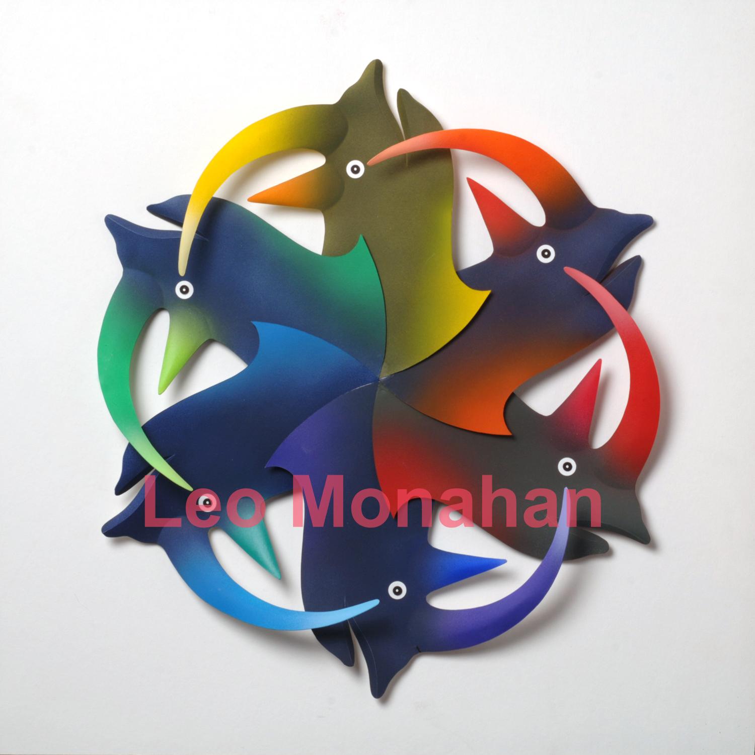
The rhino color wheel was designed like a child’s toy, and the center “fan” is an intense but dark color wheel of primary and secondary colors. The horns are also of high intensity but isolated and brighter; they’re like handles for throwing the toy in a game.
I start each blog with a color wheel because, for me, it symbolizes the Bauhaus, about which Mies van der Rohe said: “The fact that it was an idea, I think, is the cause of this enormous influence the Bauhaus had on every progressive school around the globe.
Only an idea spreads so far.”
I was five years old when running through the sheets and didn’t know, or care, that the Bauhaus had been closed for five years and many of the famous instructors had fled Germany to America, where they re-opened the school.
Twenty years later, I was immersed in Johannes Itten’s color system, refined by Kandinsky, Paul Klee, and Josef Albers, who fortunately organized it into a cohesive method. I have studied, taught and used this system for the past 55 years, and it allows me to organize, innovate, experiment, and be more than happy with the surprising results.
This nostalgic image is my version of Mrs. Thompson’s backyard. Full of color and white sheets, all waving, and snapping in the wind on a hot, clear summer day.
I cut a couple hundred shapes from museum (mat) board, without a plan or intention, and put them aside. Later, I paint them in many colors, again not knowing how I’ll use them, and put them away in a box.
When I get around to assembling them into a composition, it’s like I’ve found a treasure trove that someone has prepared for me. I move the colored shapes around for a couple of days and finally glue them down and varnish them for protection.
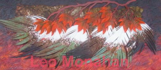
In my art I try to tell stories about seasons, conditions of age, heat, cold, and, in this case, wind. The feathers are old, nearly blown apart by the wind, left behind, and are somewhere where no one ever sees them. They’re fugitive, and they’ll be gone soon.
Old feathers out there,
Torn apart by the hot wind.
Are past life’s treasure.
I used a number of techniques in this sculpture. I painted a heavy, impasto background, brushing, sponging, splattering, and oxidizing the various elements. As before, I cut, manipulated, painted, and assembled them, in that order. It’s always a challenge and
an adventure.
Hands covered with paint.
Thrilled by color on paper.
I need a bourbon.
I’m never content with what I know,
only with what I can find out.
Thanks for visiting me…
leo
Rhino Color Wheel is $1000.
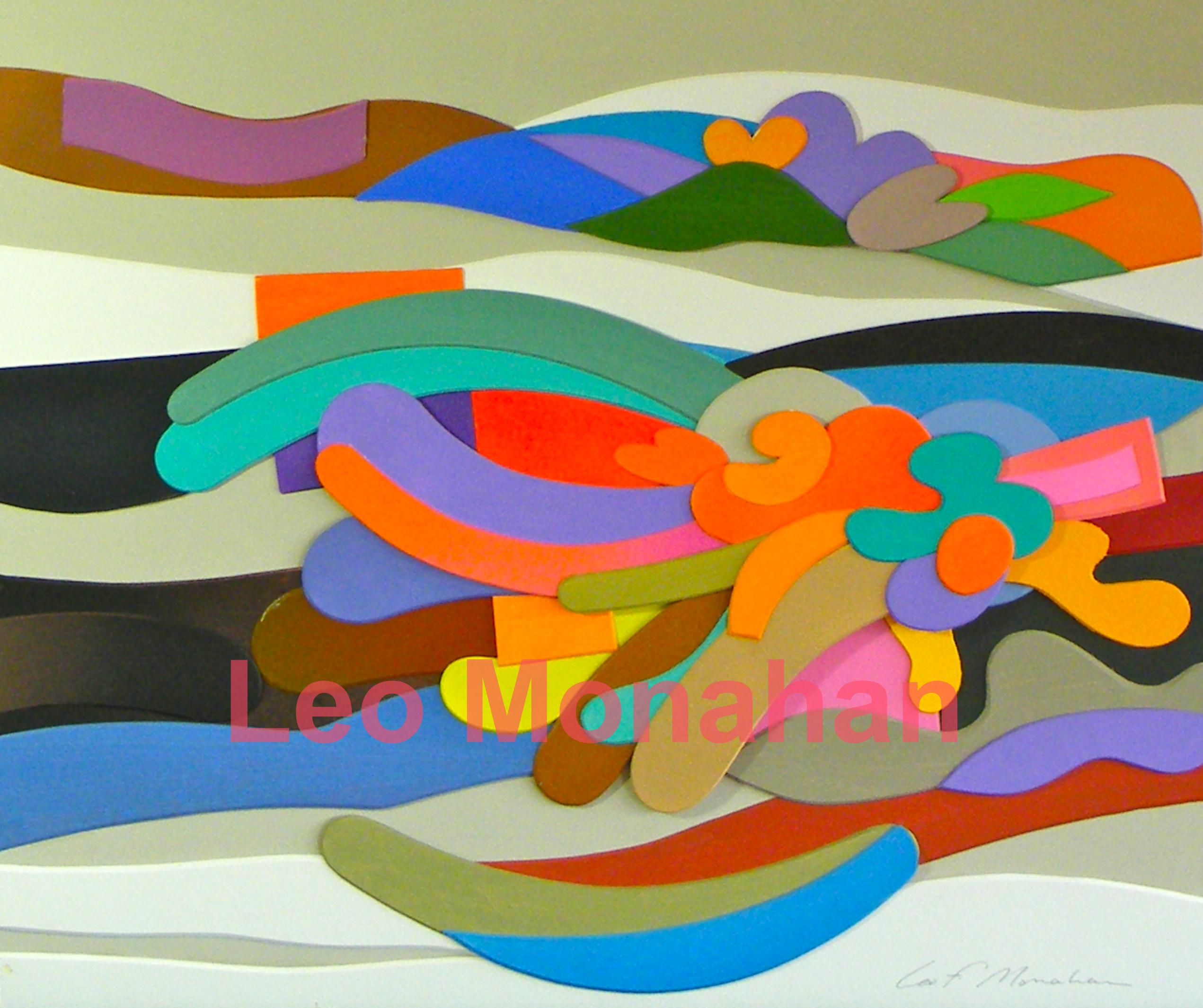
The abstract is $500. A similar one, Clouds, is available at the Cut, Bend, Fold, ColorColorColor exhibit at the Grovewood Gallery.
Japanese Maples in the Wind is $2,450 and is at the Cut, Bend, Fold, ColorColorColor exhibit at the Grovewood Gallery.

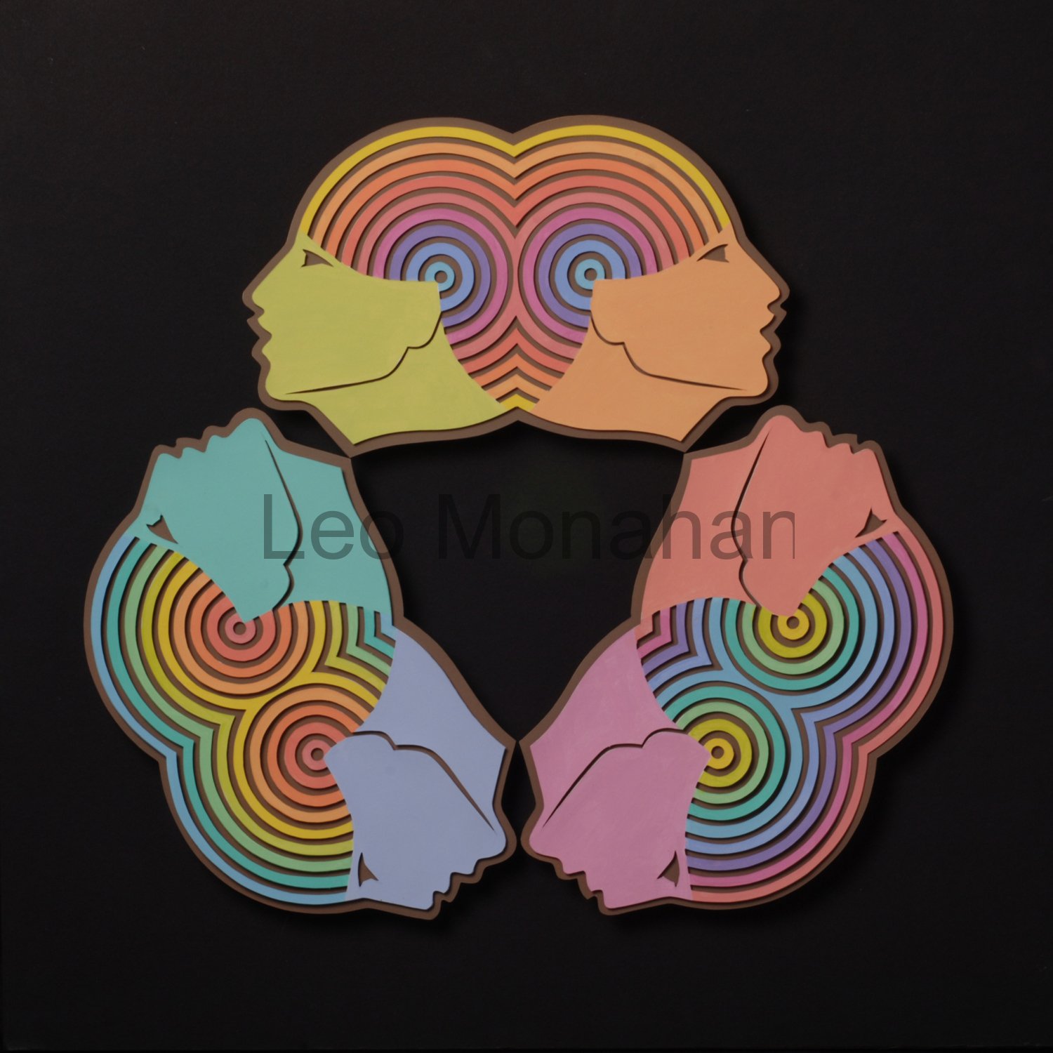 Along with other work, I will show and talk about each of my color wheels as blogs go by. The Faces logo for this blog is one of them. This one was a briar patch, but I had to finish it because I liked the concept. The six faces are tinted primary and secondary colors. The circular head-pieces are tinted color wheels, each head having a different color in the center and moving out through the spectrum. This was a ‘measure thrice, paint once’, proposition. I really had to focus to know where I was in the process.
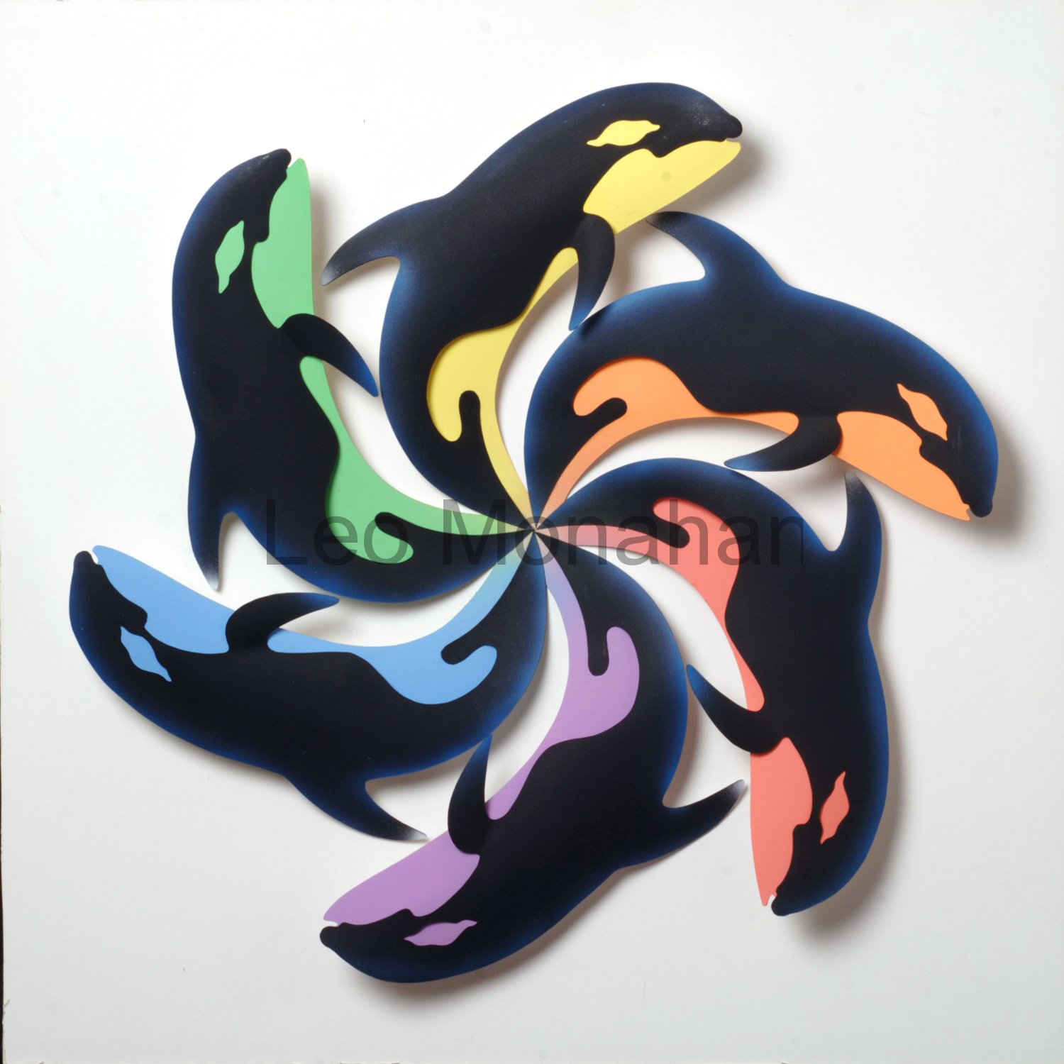 One of my favorites is “Color Whales,” because I do love a pun. Six Killer Whales are arranged in a circle with their bellies painted in tinted primary and secondary colors, yellow, red, blue, orange, violet, green, to contrast with the black bodies. As we go along, I’ll talk about the many ways of neutralizing color; tinting is one of them.